These example designs show how a small business website can feel distinctive while staying easy to understand and use. They are design concepts rather than client case studies.
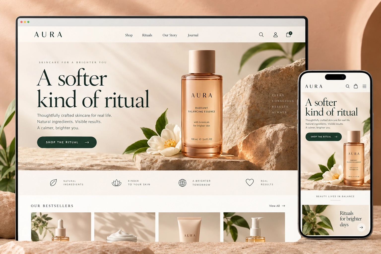
01 / ECOMMERCE WEBSITE CONCEPT
Aura
An ecommerce idea with calm navigation, confident imagery and an easy path from browsing to buying.
Product hierarchy and discovery
Responsive shopping experience
Distinctive but usable visual system
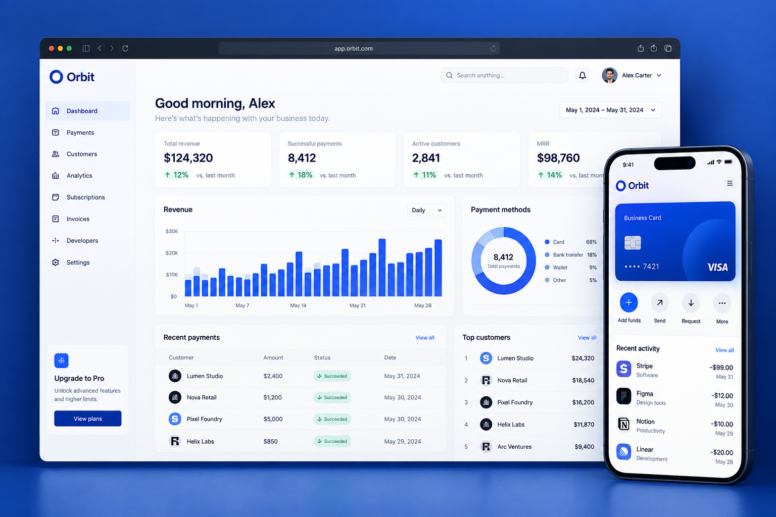
02 / DIGITAL PRODUCT CONCEPT
Orbit
A dashboard concept that organises dense information into useful priorities, visible actions and a consistent interface system.
Information hierarchy
Task-focused interface patterns
Clear states and navigation
WHY THE DESIGN LOOKS THIS WAY
Make the important information easy to find.
We decide what customers need to understand and what they should do next before choosing colours, images and page details.
01
Structure first
Organise pages, information and decisions before detail makes the experience harder to change.
02
A distinct direction
Use typography, imagery and layout to give the business a recognisable presence without sacrificing clarity.
03
Designed for the next action
Make the important route visible, whether the goal is an enquiry, purchase or task inside a system.
HAVE A PROJECT IN MIND?
Bring the problem. We’ll shape the direction.
Tell us what the experience needs to explain, change or make easier.
 RezempDigital studio